What is Responsive CSS Framework?
The Responsive CSS framework is a Pre-Build Template build with HTML5, CSS3, and JavaScript. Every framework shares different structure or layout. It is extensively customizable and flexible which can adopt your design. I have listed few CSS framework for your web design project.
Zurb Foundation
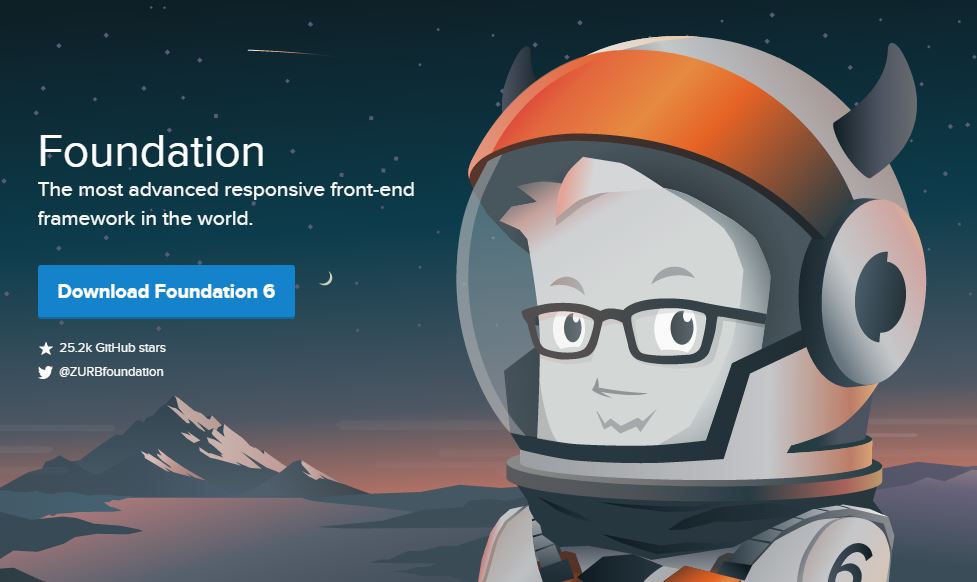
This is the most modern Frontend framework developed by ZURB. Foundation is very stable and well-structured framework. Foundation is very flexible, reliable and customizable framework. Foundation can adopt any design. It uses mobile first concept. In addition to websites, Beautiful responsive emails designs can also do with Foundation.
Bootstrap Responsive Front-end Framework
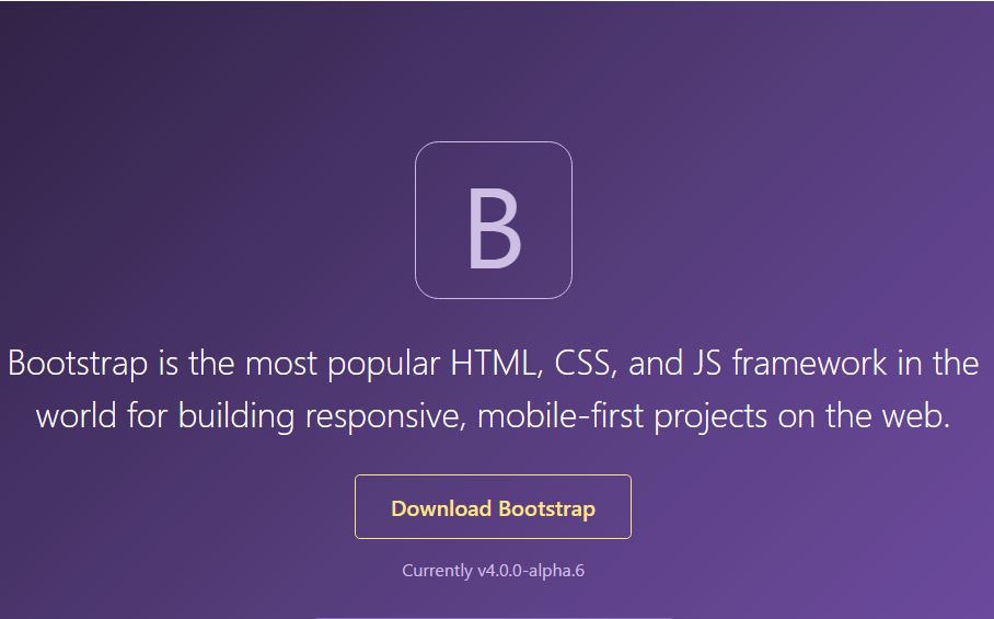
Bootstrap is also another most popular front-end framework. It is most probably the most used front-end framework. Most of all we use Bootstrap in our Magic Web India website. Bootstrap systems on Twitter.It uses
Presently Bootstrap uses LESS CSS. Bootstrap 4 will be using SASS instead of LESS. Bootstrap is powerful and now adopting the Mobile First concept. You can download the Bootstrap and start coding your website from scratch. You can also get readymade Bootstrap based Templates from other sites like Bootstrap Theme Store or Themeforest.
Cardinal
Cardinal is a mobile-first approach. If you are looking for Performance oriented and lightweight CSS Framework, it is the one. Also, this Framework is built on less. Certainly, the size is just under 12 kb.
Pure CSS
The lightweight Pure CSS module can use in any web-based project. The total size is just 3.8kb.
Awesomeness
Awesomeness made with SASS and Compass. Unlike most of the boilerplate, the Awesomeness uses a Flexible grid system. Also, Awesomeness also uses CSS Transitions, Font-Awesome, modernizr.
Cascade Framework
Cascade is a very simple framework. It is modular and full of Features. Find more information about the cascade here.
Layoutit
If you want to code your design quickly and quietly than Layoutit is the one. This interface builder is the quickest site builder for Bootstrap. Just drag and drop the bootstrap component and you are done.
Amazium
Finally, a minimalist boilerplate is here. Amazium is smaller than 9 kb after gzip. Design with the most Flexible grid system. It also has support for LESS and Flexbox.
HTML5 Mobile Boilerplate
This boilerplate is the mobile version of the most famous HTML5 Boilerplate. Unlike another CSS framework, this boilerplate is mostly used for developing mobile websites and apps.
Wirefy
Powerful wireframing for modern web development. Download the Wirefy.
Kraken
Mobile-first CSS framework for web developers. Kraken is gulp js based boilerplate. Additionally, you can download or Clone Kraken from Github.
Photoshare
Interactive mobile and app prototyping tool. Unlike other, Photoshare is not free. You can use 30 days free trial of Photoshare and start front-end design.
YAML
This Modular, responsive CSS framework is what you need to create an accessible website. Mostly, YAML use HTML5 and CSS3. It also comes with lots of features. It is accessible to most of the browsers. Finally, YAML support the older browsers too, like Internet Explorer 6.
Taiga Boilerplate
Another SASS based web design boilerplate for front-end developers. It also uses SMACSS and BEM. You can find more information about Taiga from this link.
Responsive
The name says everything. Since it is Flexible and Extensible. Hanse, you can do more with this robust developer framework rather than designer-friendly. Mostly Responsive is also built on HTML5 Boilerplate and Bootstrap.
Codeply
Finally, a front-end designers playground is here. You can compare and test with Codeply. Find more information about Codeply here.
Materialize
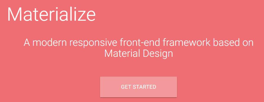
Another Modern CSS Frame to create websites based on the Material design concept. Since it is Developer Friendly and User Interface focused, You can speed up your web development time with the Materialize.
UIKIT
Another user interface focused front-end framework for web designers. Visit the UIKIT website.
Skeleton
Sturdy and lightweight responsive html5 boilerplate. Visit Skeleton Website for more information.
Cute Grids
Clean responsive CSS framework for web designers. Visit the Cute Grid website.
Flex
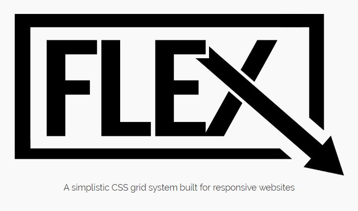
Flex is the Flexible and responsive grid system. The advantage of using flex is to use flexible Grids rather than framework specific grids. Visit the Flex website.
Semantic UI
An UI focused tool. You can quickly design responsive user interface using Semantic UI.
ThinkinTags
Rapid prototyping and visual web interface builder tool for designers and developers. Go to ThinkinTags site.
Refills
Beautiful components and patterns for the web. Refill is created by Bourbon and mostly built with bourbon and neat. Go to the Refill website.
Coffee Cup Responsive Layout Maker
This is another paid visual editor yet layout builder. You can visually create a responsive layout using this tool. Go to Coffee Cup website to learn more about this tool.
Simbla
Again another visual responsive website and app builder tool. Unlike Coffee Cup, Simbla has both free and paid version. Visit the simbla website.